Client
Venue Manager
Venue Manager
Role
Graphic design
Graphic design
Year
2017
2017
A unified brand for live experiences — Visual identity and website for Venue Manager
Venue Manager is a Danish software platform built to manage ticket sales, passes, sponsorships, merchandise and more for sports clubs, festivals and concert venues. The goal was to create a modern and trustworthy visual identity that could appeal to a wide range of clients while reflecting the company’s role as a professional partner within the live event industry.
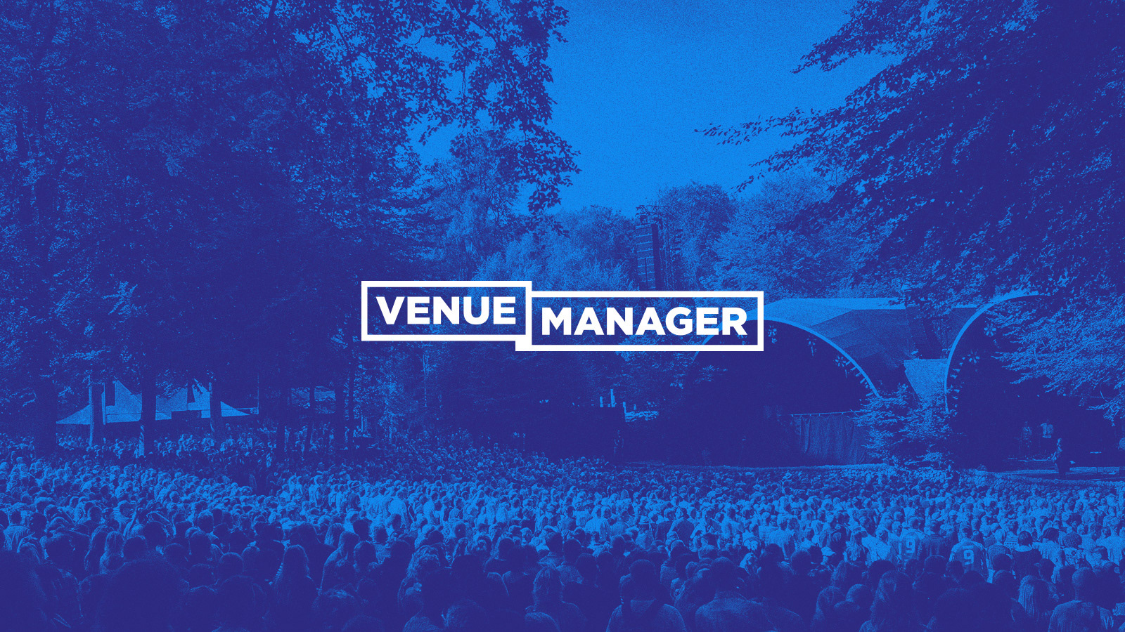
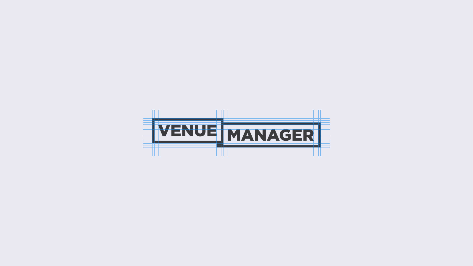
The logo design was inspired by the shape of a ticket, symbolizing the core of what connects all of Venue Manager’s solutions. This simple but distinctive idea became the foundation for a visual identity that is both recognizable and versatile. The bold blue color and large blue surfaces were chosen to differentiate the brand from competitors, while the clean and minimalistic design language communicates professionalism and confidence.
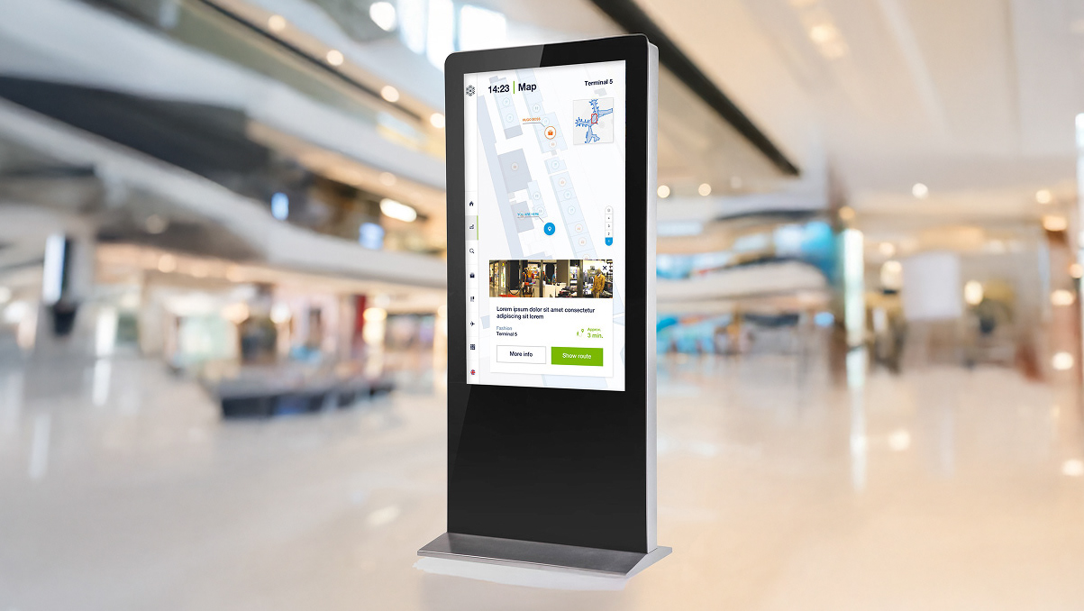
Alongside the visual identity, I also proposed a design for the company’s website with a focus on clarity, usability and conversion. The structure emphasizes key product offerings and value propositions, making it easy for potential clients to understand Venue Manager’s platform at a glance.
Impact
The new identity and website gave Venue Manager a cohesive and credible brand presence that stands out in a crowded market. By combining simplicity, color and purpose, the design now reflects the company’s strong position as a reliable partner for events of any scale — from major festivals to local sports clubs.
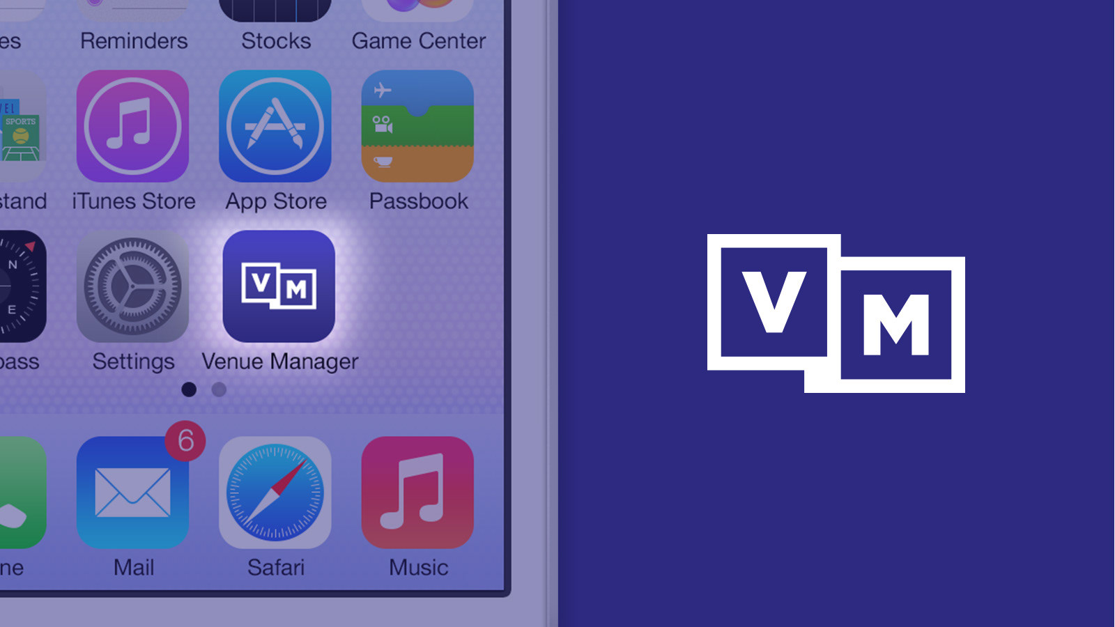
Alternative logo
I knew the logo was also going to be used in a future app so I decided to design an alternative version more suited as an icon on a mobile screen. Also this version would come in handy for the mobile version of the website.
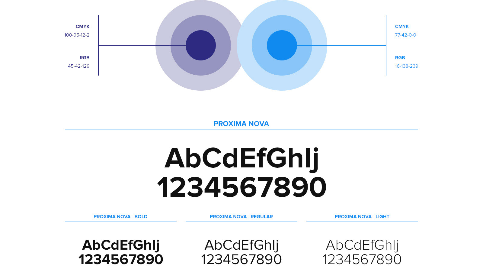
Colors & fonts
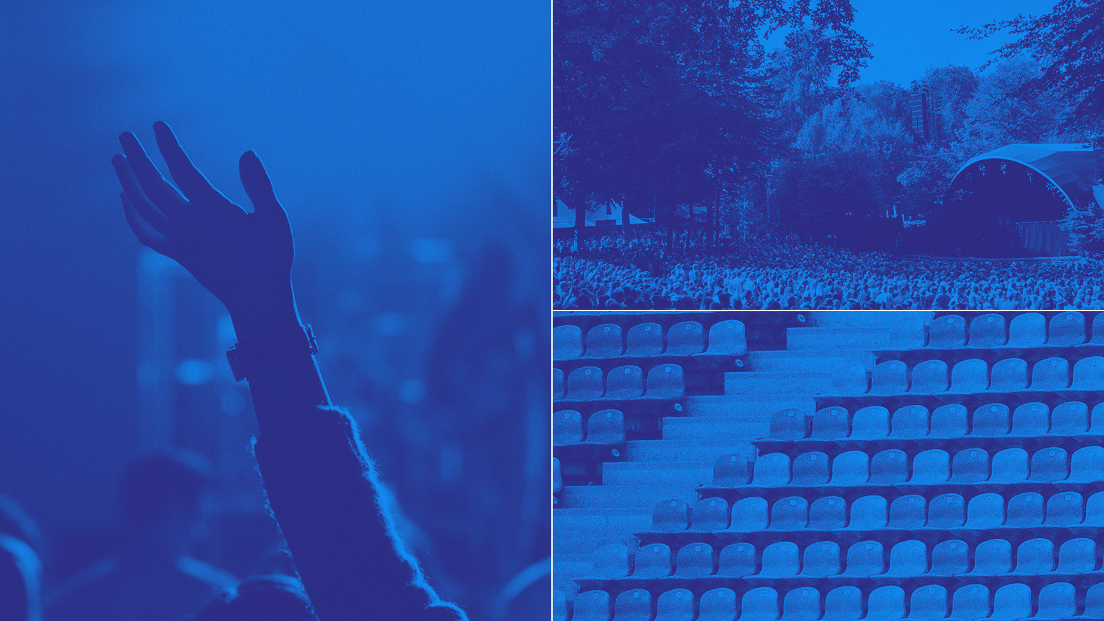
Images style
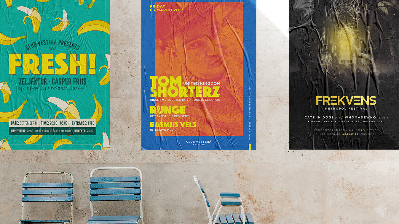
A duo-tone’ish image effect was introduced to make the overall identity a bit more unique
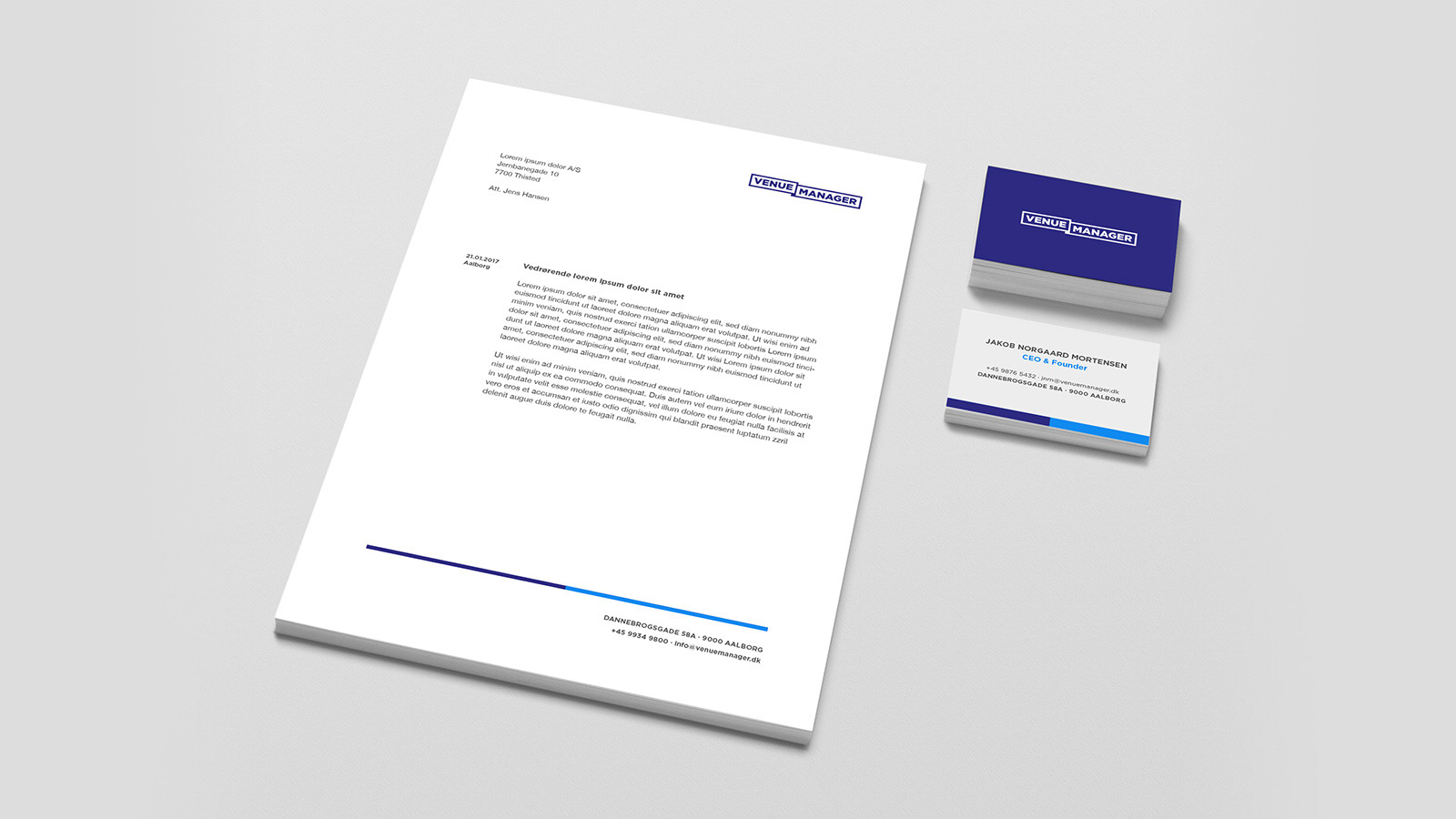
Letterhead & business card
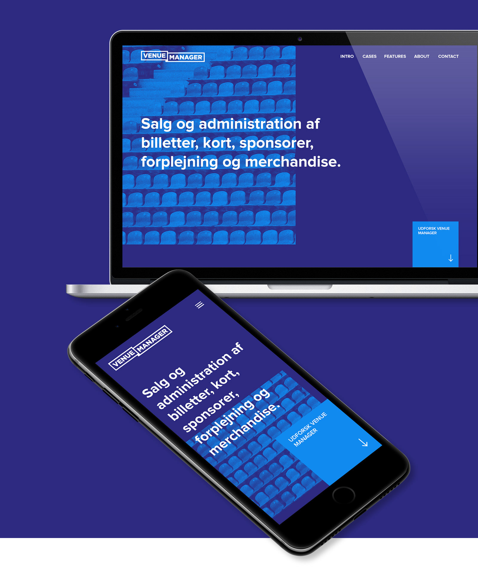
Website
Playing off the two-piece layered design of the logo so does the website incorporate this feeling with the header split in two and slightly moved apart. This is the proposed design, not the final one in use.
—
Created with ♡ by Kenneth Runge aka Pixelmuse.
© All rights reserved.
© All rights reserved.